Remember the vibrant sunsets of your childhood, the mesmerizing Northern Lights, or the captivating iridescence of a dragonfly’s wing? That, my friends, is the magic of gradients – smooth transitions of color that evoke beauty, depth, and dynamism. And guess what?
Once considered a relic of digital art’s early days, gradient graphics have made a triumphant return, proving that old trends can indeed come back around, reinvented and more vibrant than ever. This blog explores the resurgence of gradient graphics, 7 types, and how to master this trend to elevate your designs.
Gradient In Graphic Design
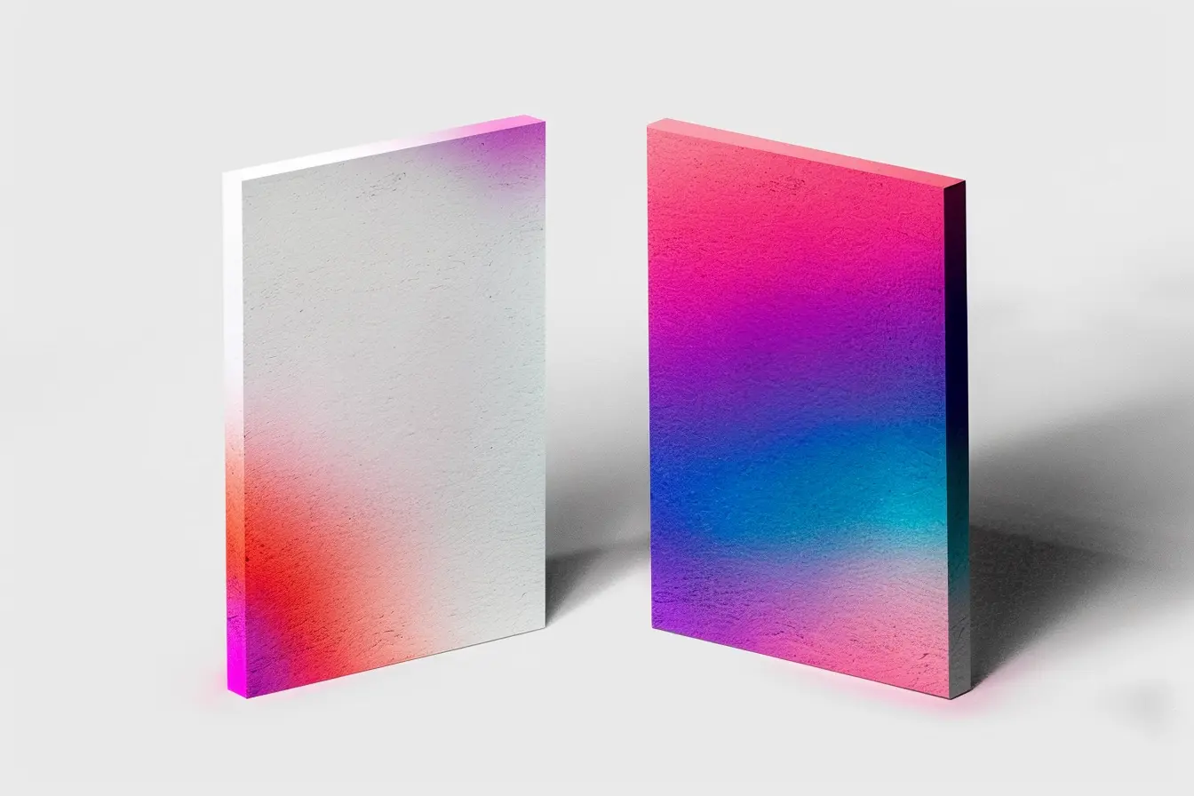
A gradient in graphic design is a gradual blending of one color into another, creating a smooth transition between colors that can add depth, dimension, and a touch of realism to designs.
Their roots stretch back centuries, from ancient stained glass windows to the Op Art movement of the 1960s. Gradients were a hallmark of the web design era of the late ’90s and early 2000s, often used to add a 3D effect to elements before flat design took precedence. As design tools and technologies evolved, gradients fell out of favor, deemed too flashy or outdated. However, recent years have seen a resurgence, with gradients becoming more sophisticated and subtle, reflecting modern tastes and advanced digital capabilities.
So, why are gradients hotter than ever?

The resurgence of gradients in contemporary design is not merely a nostalgic revival but a strategic embrace of their aesthetic and functional versatility in today’s digital milieu. Enhanced display technologies now allow for smoother transitions between hues, showcasing gradients in their full splendor, a feat less achievable with the hardware of yesteryears. This technical advancement means designers can experiment with gradients that are more complex and subtle, moving beyond the bold, often garish gradients of the past to create designs that are nuanced, vibrant, and full of life.
Modern and eye-catching
The digital design landscape has been dominated by minimalism and flat design for quite some time, leading to a uniformity that gradients can effectively disrupt. They introduce depth and dimension in a way that adds complexity and visual interest without sacrificing the principles of clean and functional design. This ability to blend into minimalistic aesthetics while adding a layer of sophistication and dynamism makes gradients particularly appealing.
Customization and flexibility:
Gradients have become a tool for psychological engagement. The right gradient can evoke emotions, signify brand identity, and guide the user’s attention through a digital space, making interfaces not just more attractive but also more intuitive. The customization and flexibility of gradients allow designers to craft unique visual stories, making each design distinct and memorable in a crowded digital space.
Social media and digital marketing have also played significant roles in the gradient renaissance
Platforms like Instagram and Spotify have leveraged gradient backgrounds and elements in their branding and UI designs, setting trends that many others follow. This widespread adoption by influential digital brands has cemented gradients’ place in current design trends, showcasing their effectiveness in engaging and retaining user attention.
Depth and dimension:
Gradients create a sense of depth and dimension, making flat designs appear more dynamic and engaging. Think of it as adding a subtle 3D effect without the extra work.
Beyond the basic linear gradient, a whole world of options awaits
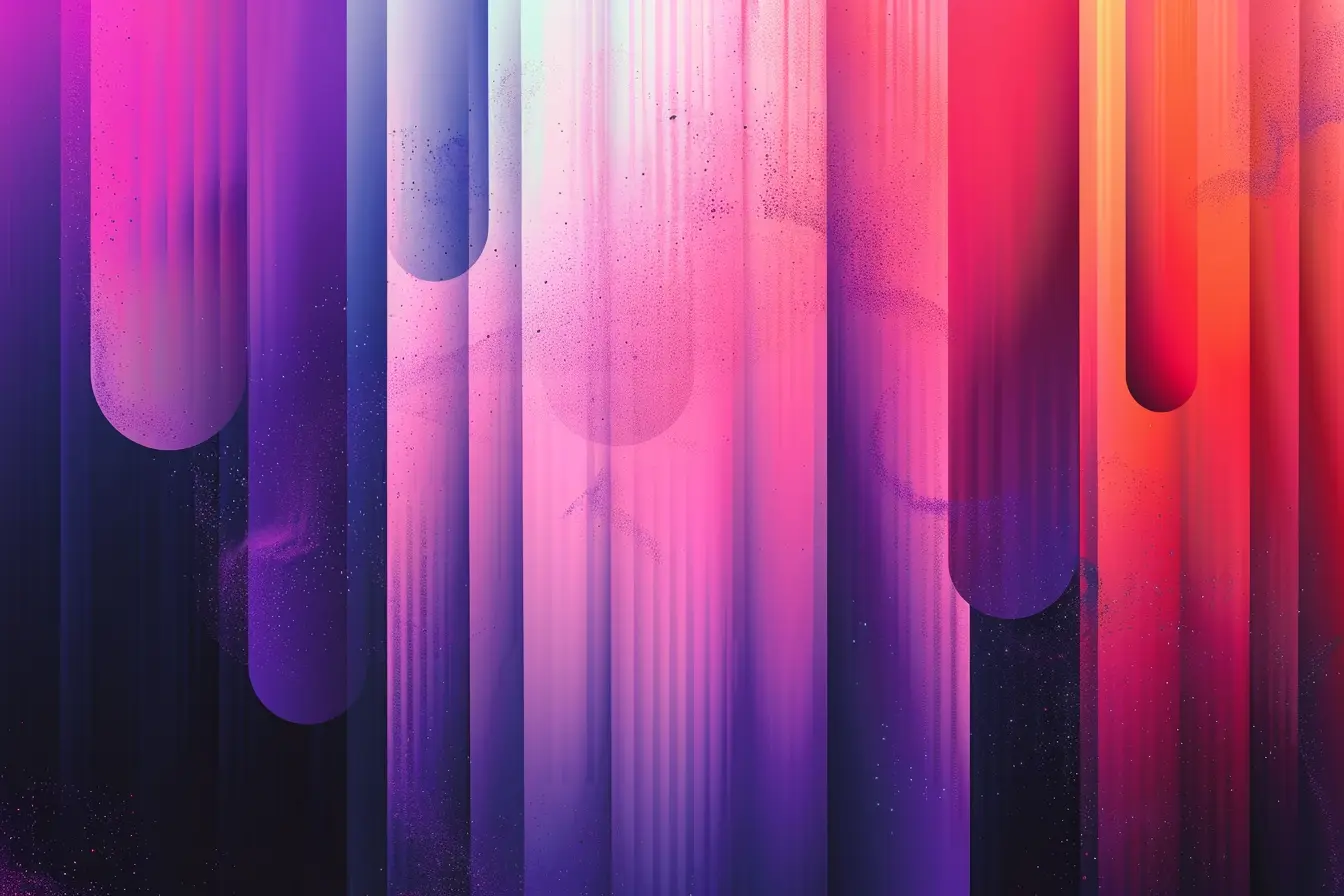
Gradients come in a variety of forms, each offering a unique aesthetic and mood for digital designs. Expanding upon the types mentioned:
1. Linear Gradients

Linear gradients transition colors along a straight line, creating a seamless blend from one color to another. This type of gradient is versatile and widely used, perfect for backgrounds, buttons, and graphics where a subtle or bold transition is desired. Designers can control the direction of the flow, whether it’s vertical, horizontal, or at an angle, to align with the design’s overall composition.
2. Radial Gradients

Radial gradients emanate from a central point, spreading outward in a circular or elliptical shape. This gradient type can create a focal point or simulate light falling onto an object, adding depth and dimension. It’s particularly effective for highlighting elements on a page or creating a spotlight effect.
3. Angular Gradients
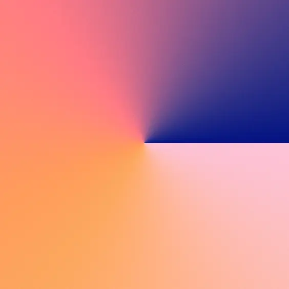
Also known as conic gradients, angular gradients feature color transitions that wrap around a central point, mimicking the look of a color wheel. This type is less commonly used but offers unique visual effects, ideal for creating pie charts, color wheels, or any design element that benefits from a circular color transition.
4. Mesh Gradients

Mesh gradients are complex, allowing for a multi-color blend across a surface with fine control over each point of color. Designers can manipulate numerous points within a mesh to create intricate and highly detailed gradient effects that can mimic natural elements like skies or landscapes with unparalleled realism.
5. Diamond Gradients
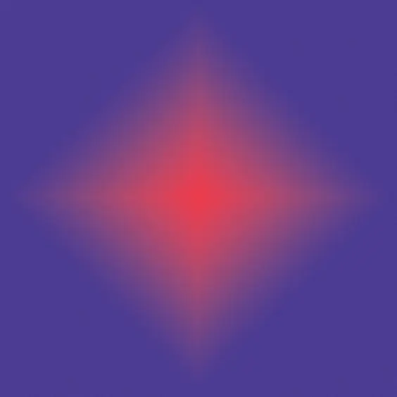
Diamond gradients feature color transitions that spread diagonally from a central point, forming a diamond shape. This type adds a unique geometric aesthetic to designs, useful for backgrounds or elements that require a striking visual impact.
6. Shape Blur Gradients
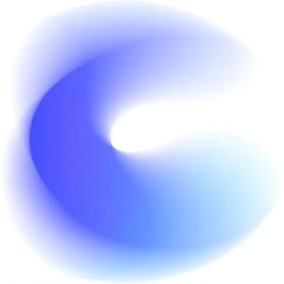
Shape blur gradients involve the application of a blur effect within a specific shape, softening the color transitions. This technique can create a dreamy or ethereal look, blending colors in a way that mimics natural phenomena like the blurring of lights or the soft transitions of a watercolor painting.
7. Freeform Gradients
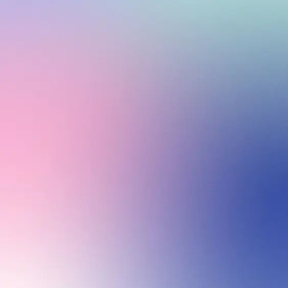
Freeform gradients offer the ultimate creative freedom, allowing designers to place colors at any point on the canvas and control the spread and blend of each. This type can produce highly customized and organic-looking gradients, ideal for creating vivid, eye-catching backgrounds or elements that require a specific color flow.
Each type of gradient offers unique possibilities and can be used alone or in combination to achieve the desired visual effect. Understanding and experimenting with these different types can help designers master the art of gradient application, enhancing the visual appeal and dynamism of their designs.
But how do you harness this gradient power effectively?
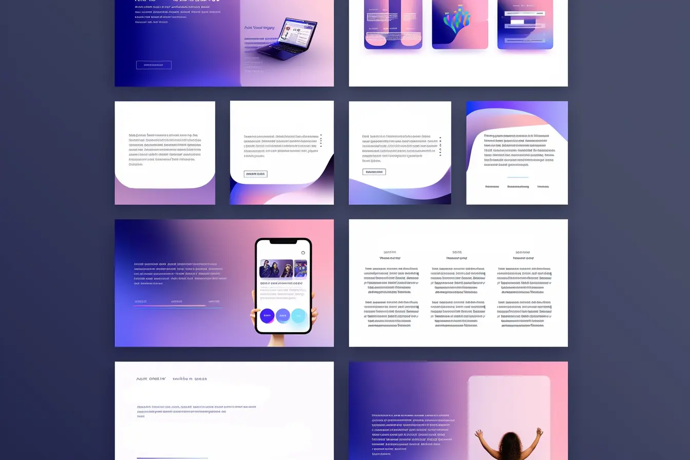
Mastering the gradient graphic design trend involves more than just applying vibrant colors; it requires a strategic approach to ensure that the gradients enhance the design without overwhelming it. Here are some key tips to help designers effectively incorporate gradients into their projects:
1. Balance with Composition:
Ensure that the gradient complements the overall design composition. Gradients should enhance the visual hierarchy, guiding the viewer’s eye to key elements without distracting from the content. Use gradients to create depth and interest, but maintain balance to avoid visual clutter.
2. Choose Colors Wisely:
The choice of colors in a gradient can dramatically affect the mood and effectiveness of a design. Select colors that align with the design’s theme and the brand’s identity. Experiment with color theory to find combinations that evoke the desired emotions and responses. Consider using tools like Adobe Color or Colors to explore and generate harmonious color schemes.
3. Gradual Transitions:
The beauty of gradients lies in the smooth transition between colors. Ensure transitions are smooth and natural, avoiding harsh lines unless they are a deliberate design choice. Tools like Adobe Photoshop and Illustrator offer features to adjust the spread and transition of colors for a seamless blend.
4. Use Gradients for Visual Storytelling:
Gradients can be powerful tools for visual storytelling. Use them to mimic natural phenomena, such as sunsets or ocean depths, to evoke specific settings or atmospheres. This can add a layer of narrative depth to your designs, making them more engaging and memorable.
5. Test Across Different Mediums:
Gradients may look different on various displays and mediums. Test your designs across different screens and printouts to ensure consistency and quality. This is particularly important for web and mobile designs, where the appearance can vary significantly across devices.
6. Incorporate Texture and Depth:
Beyond color transitions, gradients can be used to add texture and depth. Experiment with adding grain or noise to your gradients for a more tactile feel, or use gradients as overlays on images or patterns to create depth and interest.
7. Stay Updated with Trends:
While gradients are currently trending, the specific styles and applications of gradients evolve. Stay updated with design trends by following design blogs, attending webinars, and engaging with the design community on platforms like Behance and Dribbble. This will inspire you and help you keep your gradient usage fresh and relevant.
8. Practice and Experiment:
Finally, mastering gradients requires practice and experimentation. Don’t be afraid to try new combinations and techniques. Use personal projects or concept designs as a playground for exploring the potential of gradients. Over time, you’ll develop an intuitive sense for how to best apply gradients to create stunning, impactful designs.
So, which design types benefit most from gradients?

The answer is: almost all! From logos and website headers to illustrations, social media graphics and print materials, gradients can add a touch of magic and make your design stand out.
In Conclusion
In conclusion, the gradient trend isn’t just a fad; it’s a versatile tool that can elevate your designs to new heights. So, embrace the colorful wave, experiment with different types, and watch your creativity blossom! Remember, the only limit is your imagination.
Whether you’re designing a website, a mobile app, or brand identity, gradients can add that extra layer of depth and visual interest that captures attention and communicates your message in a visually compelling way.
Now go forth and paint your design world with stunning gradients!


