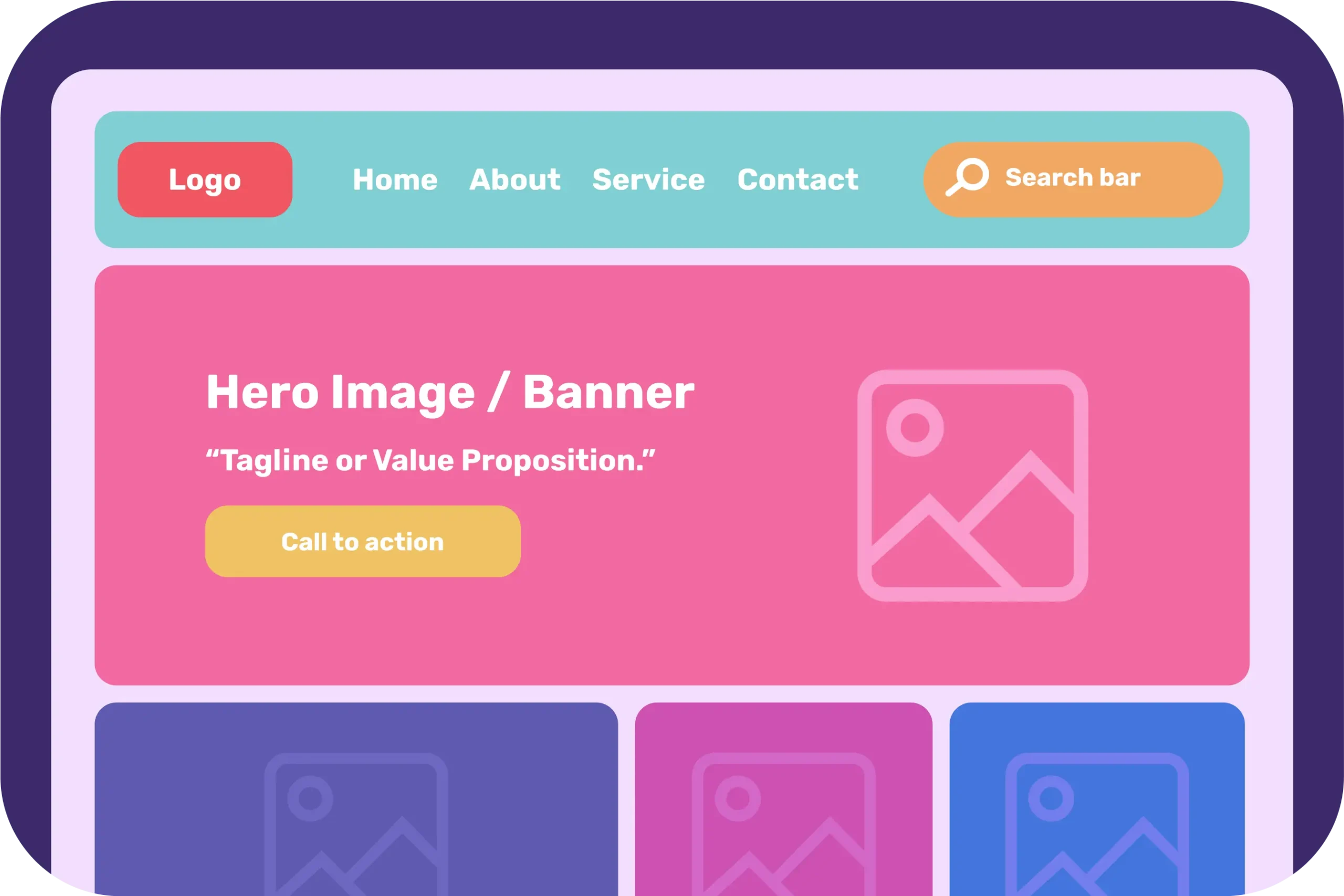
Is your website visitor bouncing away before they even explore your content? The culprit could be a weak website header! A website header is the first thing visitors see when they land on your site. It sets the tone for your brand, guides navigation, and can significantly impact user engagement. According to a study by Nielsen Norman Group, users often leave web pages within 10-20 seconds, emphasizing the importance of capturing their attention quickly with an effective header.
Elements of a Website Header
A well-designed website header is composed of several critical elements that work together to create a cohesive and functional user experience.

1. Logo
The logo plays a vital role as a visual representation of your brand, serving as a key element for brand recognition. Typically placed at the top left corner of the header, the logo should be clear, high-resolution, and linked to the homepage for easy navigation.
2. Navigation Menu:
The navigation menu helps users find the information they need quickly and efficiently. A horizontal navigation bar is most common, listing the main sections of the website, and dropdown menus can be utilized for more detailed navigation. It is important to keep the menu simple and intuitive, using clear and concise labels while limiting the number of menu items to avoid overwhelming users. Plus, using sticky headers to point user’s attention to critical features or calls to action.
3. Call to Action (CTA):
Incorporating a call to action (CTA) within the header is crucial for encouraging users to take specific actions, such as signing up for a newsletter, making a purchase, or contacting the company. CTAs should be designed to stand out with contrasting colors and placed prominently within the header. The wording should be compelling and action-oriented to drive user engagement.
4. Search Bar:
A search bar enhances the user experience by allowing visitors to quickly find specific information, especially on content-heavy websites. Typically located in the top right corner of the header, the search bar should be clearly visible and functional, potentially featuring suggestions or auto-complete options to assist users in their searches.
5. Contact Information:
Including contact information in the header provides users with an easy way to get in touch with the company. This information can include a phone number, email address, and links to social media profiles. To maintain a clean design, social media icons can be used to save space.
6. Hero Image or Banner:
The hero image or banner grabs attention and sets the visual tone for the site. It can highlight promotions, important announcements, or the core value proposition of the site. High-quality, relevant images should be used, and the banner should not be too large to ensure it does not overshadow other elements. Text overlays or CTAs within the banner can add further impact.
7. Tagline or Value Proposition:
A tagline or value proposition communicates the key message or value of your brand in a succinct manner. Often placed near the logo or as part of the hero banner, the message should be short and impactful, using a font size and style that makes it easy to read at a glance.
Tips to Create Your Stunning Website Header

Creating a stunning website header is crucial for making a strong first impression and enhancing user engagement. Here are some comprehensive tips to ensure your website header stands out:
1. Keep It Simple:
A clean and straightforward header design is key to making navigation easier and improving user experience. Avoid clutter by including only the essential elements such as the logo, navigation menu, and a call to action. A minimalist design helps users focus on the main aspects of your site without being overwhelmed by too much information.
2. Use High-Quality Images:
If your header includes images, ensure they are high-resolution and relevant to your brand. Blurry or pixelated images can detract from the professionalism of your website. A high-quality hero image or banner can grab attention and set a positive visual tone. It’s also beneficial to use images that convey your brand’s message or showcase your products effectively.
3. Optimize for Mobile:
With the increasing use of mobile devices, it’s essential to ensure your header looks good and functions well on all screen sizes. Responsive design practices should be employed so that the header adapts seamlessly to different devices. This includes ensuring that text remains readable, images scale appropriately, and navigation elements remain accessible.
4. Consistency:
Consistency in design across your website is crucial for a cohesive brand experience. Ensure your header aligns with your overall brand aesthetic, including colors, fonts, and imagery. Consistent branding helps build trust and recognition with your audience. This means using your brand’s color palette, typography, and design elements uniformly throughout the header.
5. Test and Iterate:
Use A/B testing to see what works best for your audience and be prepared to make adjustments based on the data. Testing different variations of your header can provide insights into what elements drive the most engagement. This could involve experimenting with different CTAs, images, or navigation structures to find the most effective combination.
6. Clear Call to Action:
Your header should have a prominent and clear call to action (CTA) to guide users towards desired actions such as signing up for a newsletter, making a purchase, or contacting you. The CTA should be easily noticeable, with contrasting colors that stand out against the background. The wording should be direct and compelling to encourage user interaction.
7. Readable Typography:
Use fonts that are easy to read and fit your brand’s style. Avoid overly decorative fonts that can be difficult to read, especially in smaller sizes. Ensure there is sufficient contrast between the text and the background to maintain readability. Proper typography helps in delivering your message clearly and effectively.
8. Fast Loading Times:
A header that loads quickly is essential for retaining visitors. Optimize images and minimize the use of heavy scripts to ensure fast loading times. Slow-loading headers can frustrate users and lead to higher bounce rates. Using efficient coding practices and leveraging browser caching can also improve load times.
9. Accessibility:
Make sure your header is accessible to all users, including those with disabilities. This involves using alt text for images, ensuring high contrast for text, and employing ARIA landmarks for better navigation. Accessibility not only enhances the user experience for everyone but also ensures compliance with legal standards.
10. Personalization
Depending on your audience, consider adding personalized elements to your header. For example, if you have a returning visitor, you might display a personalized greeting or relevant content recommendations. Personalization can make users feel more connected to your brand and improve their overall experience on your site.
03 Good Heading Examples
Effective website headers not only serve as navigational tools but also encapsulate the brand’s essence and user experience philosophy. Here are three examples of website headers that excel in different areas:
1. Ahrefs: Unique Selling Point
Ahrefs’ website header stands out by immediately emphasizing its unique selling points (USPs). Upon visiting Ahrefs, users are greeted with a clear and compelling value proposition. The header succinctly communicates what Ahrefs offers—comprehensive SEO tools designed to improve search engine rankings and traffic. The header features a simple yet bold design, with the main navigation menu, logo, and a strong call to action button for starting a free trial. This approach effectively captures the visitor’s attention and clearly conveys the primary benefits of using Ahrefs, making it easy for users to understand the value they will receive.
2. Humaan: Using Sticky Menu
Humaan’s website, found at Humaan, utilizes a sticky menu in its header to enhance user navigation. A sticky menu remains fixed at the top of the screen as users scroll down the page, ensuring that the navigation options are always accessible. This design choice improves user experience by allowing easy access to different sections of the site without the need to scroll back up. The sticky header is clean and minimal, with clear navigation links and a concise call to action. This approach not only enhances usability but also keeps the brand’s aesthetic intact as users interact with the website.
3. Tesla: Leveraging Minimalism and Impact
Tesla’s website, accessible at Tesla, is a masterclass in leveraging minimalism for maximum impact. The header is strikingly simple, featuring the Tesla logo, a minimal navigation menu, and high-impact visuals. The minimalistic design directs focus to the high-quality images of Tesla’s products, reinforcing the brand’s commitment to innovation and design excellence. The header does not overwhelm visitors with excessive information; instead, it offers a clean, elegant interface that highlights Tesla’s cutting-edge technology and sleek aesthetics. This approach not only aligns with the brand’s identity but also provides a seamless and engaging user experience.
Conclusion
A well-designed website header is crucial for making a positive first impression and enhancing user experience. By incorporating essential elements, following design best practices, and learning from successful examples, you can create a stunning header that not only captures attention but also drives user engagement and satisfaction.


