A potential customer eagerly clicks on your website, ready to be wowed. But instead of dazzling design, they’re greeted with blurry images and text that looks like it shrunk in the wash. Not exactly the first impression you were hoping for, right?
Gone are the days when desktop computers were the sole gateways to the vast expanse of the internet. Today, a multitude of devices, each with its own screen size and resolution, forms the mosaic through which the digital world unfolds before our eyes. This transformation has catapulted screen resolution from a technical footnote to a central player in the user experience of a WordPress website. Screen resolution plays a pivotal role in the user experience of a WordPress website. It determines how content and design elements appear across different devices, from desktop monitors to mobile phones. A website that looks great on one screen might not work as well on another if not designed with multiple resolutions in mind.
Understanding Screen Resolution in WordPress Context

Screen resolution refers to the number of pixels displayed on a screen, represented by width x height dimensions. It determines how crisp and clear the elements on your website appear. For instance, a high-resolution screen will showcase sharp images and text, while a lower resolution might display them in a blurry or distorted way.
In the WordPress ecosystem, understanding screen resolution helps in crafting websites that are visually appealing and functionally robust across all devices. This comprehension is fundamental for themes and plugins that aim to be versatile and accessible.
The Importance of Responsive WordPress Website Design: Catering to the Multi-Screen Multitude

Remember the days when desktops reigned supreme in the digital kingdom? Those times are long gone. Today, we’ve become a multi-screen multitude, juggling desktops, laptops, tablets, and smartphones – all vying for our attention. This presents a challenge for website owners: how do you ensure your WordPress website delivers a flawless experience on each device? But the benefits go beyond aesthetics. Here’s why responsive design is a must-have for your WordPress website:
1. Enhanced User Experience (UX):
No more pinching, zooming, or scrolling sideways just to read text or click on buttons. Responsive design ensures a smooth and intuitive experience for all users, regardless of their device. Frustrated users often become lost visitors, and responsive design keeps them happily engaged.
2. Search Engine Optimization (SEO) Boost:
Google loves websites that prioritize mobile-friendliness. Responsive WordPress website design significantly impacts search engine rankings. Search engines like Google have long favored mobile-friendly websites, recognizing their importance in providing a positive user experience. Websites that employ responsive design are more likely to rank higher in search results, making them more visible to potential visitors. This visibility is critical in the competitive digital marketplace, where being seen can make all the difference in attracting and retaining users.
3. Reduced Maintenance:
Gone are the days of needing separate websites for desktops and mobiles. Responsive design means you only need to manage one website, saving you time and resources.
4. Future-Proofing Your Website:
New devices with varying screen sizes are constantly emerging. A responsive design is like a digital insurance policy, ensuring your website remains adaptable and user-friendly for years to come.
5. Competitive Advantage:
In a crowded digital marketplace, a responsive WordPress website can set a business apart, offering a superior browsing experience that can lead to higher user satisfaction and loyalty.
Recommended Screen Resolutions for WordPress Sites:
Expanding on the recommended screen resolutions for WordPress sites involves delving into the intricacies of designing for a variety of devices, from mobile phones and tablets to desktop computers. Understanding the specifics of each resolution category is crucial for developing responsive and engaging websites that cater to the needs and expectations of users across different devices.
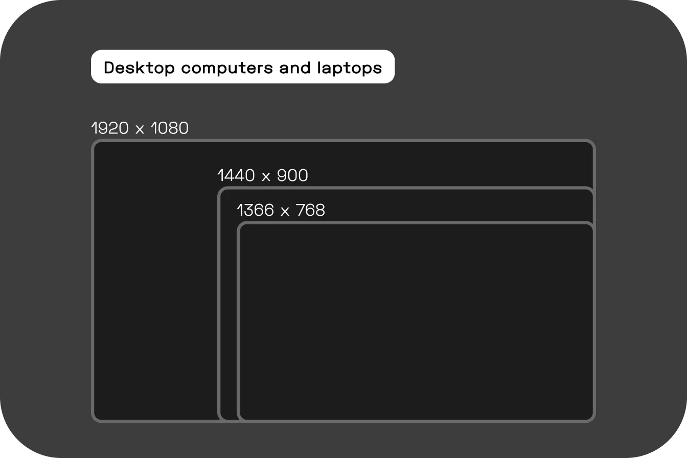
1. Desktop computers and laptops

1920 x 1080 – The most commonly used resolution for desktop computers and laptops.
Widespread Support: As a resolution supported by the majority of modern monitors and devices, 1920 x 1080 ensures that a WordPress site will look consistent and high-quality across various platforms. This universal compatibility is key to reaching a broad audience without compromising on visual fidelity.
Optimal Clarity: The sharpness of text and the vibrancy of images at this resolution contribute significantly to a positive user experience. Clear, detailed visuals are essential for engaging users and conveying the website’s message effectively.
Resource Availability: The standard nature of 1920 x 1080 means there’s a wealth of design resources, tools, and templates specifically optimized for this resolution. This can streamline the design process and ensure high-quality results.
1366 x 768:
A familiar face, especially for older laptops and some budget desktops, 1366 x 768 offers a comfortable viewing experience. While not the sharpest resolution, it remains a significant portion of the web browsing landscape. Optimizing your website for this resolution ensures a wider audience enjoys a clear and functional experience.
1440 x 900 (WXGA+): a popular choice for web design that is a relatively large size for computer monitors and laptops.
Balance of Size and Speed: While it’s not as high resolution as 1920 x 1080, 1440 x 900 is a robust resolution that offers a good balance between visual space and performance. Websites at this resolution can load faster, which is crucial for user retention, especially on mobile devices where speed is paramount.
Accessibility and Cost-Effectiveness: Targeting this resolution can be particularly strategic if your audience includes users with older hardware or slower internet connections. It lowers barriers to access, ensuring that more users can experience the website as intended without necessitating high-end devices.
2. Tablet:
768×1024:
A common resolution for many standard-sized tablets, including older iPads. Designing for this resolution involves leveraging the additional space for more detailed content and interactive elements while maintaining usability in both portrait and landscape orientations.
3. Smartphones:

Here’s where things get interesting. With a vast array of smartphone and tablet screen sizes, it’s impossible to target just one. However, some popular mobile and tablet resolutions like 375 x 667 (iPhone 6/6S/7), 414 x 896 (iPhone 11, iPhone XSMax), 360 x 640 (Samsung Galaxy Note/ Note 2/ Note 3/ Note 4/S3/S4/S4 Mini/S5/S6/S7/S7 Edge) valuable benchmarks. Optimizing for these resolutions ensures your website’s menus, buttons, and content are easily accessible and visually appealing on the most prevalent mobile devices and tablets.
Approach to Screen Resolution for WordPress Websites
Align, a website design and development website agency, prioritizes responsive design in its WordPress projects. We understand that a flexible and adaptive website reaches a wider audience, thereby enhancing the site’s effectiveness and engagement. Align employs advanced design techniques and coding practices to ensure that every WordPress site they develop performs seamlessly at any screen resolution. By focusing on user-centric design, Align guarantees that the websites not only look appealing but also provide a consistent user experience across all devices.
Conclusion
By prioritizing screen resolution and implementing responsive design, you can create a WordPress website that looks fantastic and functions flawlessly on any device. This not only enhances user experience but also portrays professionalism and keeps your audience engaged. If you’re looking to optimize your website for the modern display landscape, contact Align today.


